The Details That Make Guests Say “This Place Gets It”
There’s a moment, usually within the first sixty seconds, when a guest decides whether a place “gets it.”
Not the food. Not the wine list. Not the reservation app.
The vibe, but in the real, physical sense. The made-on-purpose sense.
It’s rarely one big thing. It’s a string of small signals that add up to trust.
And when it’s done right, nobody points at the details and says, “Wow, nice door pull.” They just relax. They lean in. They order the second drink. They stay.
That’s the game: subtle excellence.
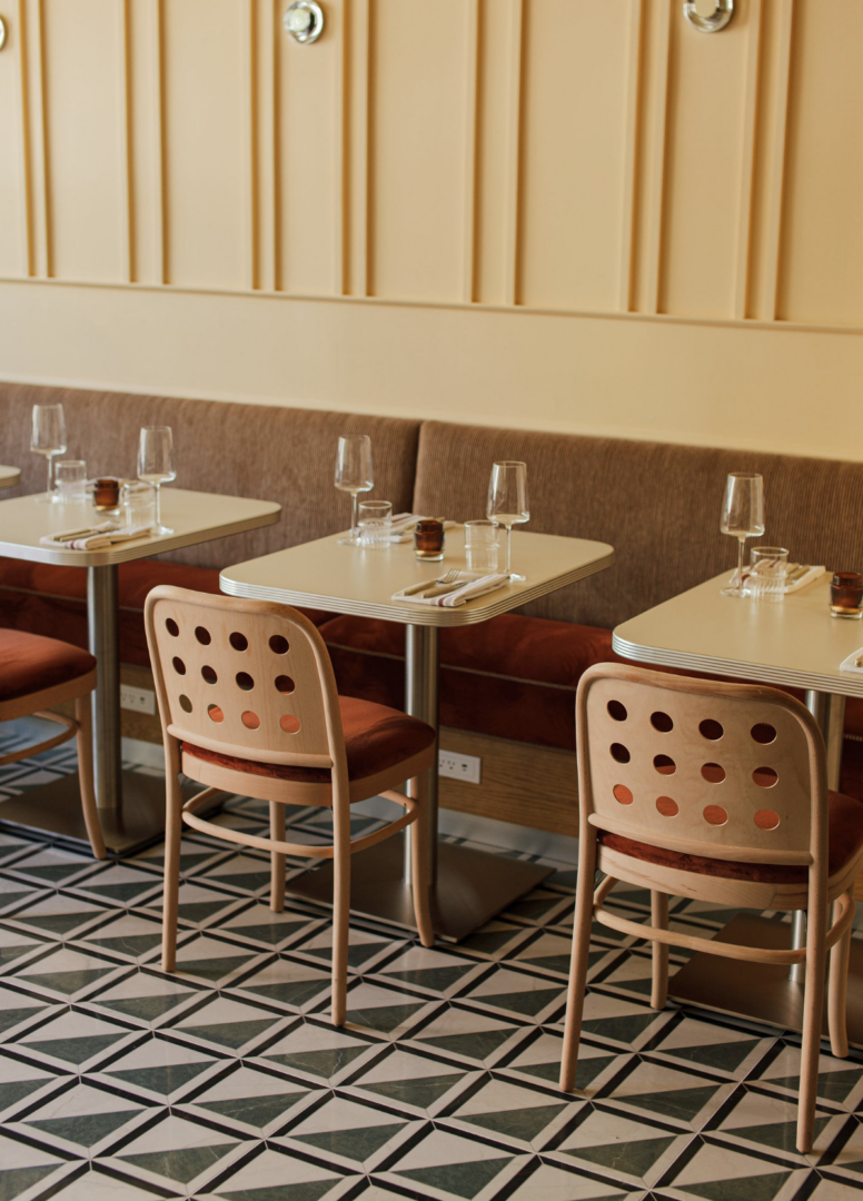
Detail 01: The hand knows first
Before guests read a sign, they touch something.
A door handle. A host stand edge. A menu cover. A chair back.
If it feels cheap, flimsy, sticky, or sharp in the wrong way, the room just introduced itself poorly.
The places that get it choose touchpoints with intention: weight, temperature, tactility. Not for “luxury.” For confidence.

Detail 02: Lighting that flatters people, not just objects
A lot of rooms are lit for photos. The great ones are lit for faces.
Guests don’t say, “Your color temperature is perfect.” They say, “I look good in here,” and mysteriously stay longer.
It’s not about more fixtures. It’s about behavior: layers, dimming range, glare control, and making sure the room works at 5pm and 11pm without turning into a different personality.
Detail 03: Acoustics that let a table feel private in public
If your room sounds like a gymnasium, nothing else matters. People won’t “power through” for the aesthetic. They’ll just not come back.
The places that get it understand the difference between energy and noise. They build warmth into the sound: surfaces that absorb, layouts that break up echo, music that supports the room instead of competing with it.
If guests can talk without yelling, they forgive a lot. If they can’t, they forgive nothing.
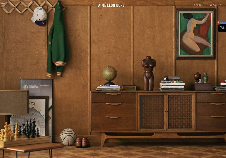
Detail 04: The menu as a designed object
A menu is branding you can hold.
The paper weight. The way it folds. The typography at low light. The spacing that makes ordering feel easy instead of chaotic. The language that sounds like the room.
This is where “nice” becomes “considered.”
And it’s where places either feel authored, or templated.
Detail 05: Wayfinding that doesn’t make people feel stupid
The best wayfinding is almost invisible, because it works.
Guests should never have to do that awkward little wander where they pretend they’re “just looking around” but they’re actually trying to find the restroom. We’ve all done it. We’ve all lied.
Hand-painted signage, gold-foil vinyl on glass, a small icon that repeats in the right places. These are the tiny tells that someone cared about the experience, not just the renderings.
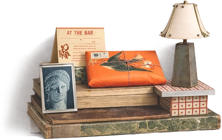
Detail 06: The take-home detail
The places that really get it give you something you want to keep, without trying too hard.
A matchbook that feels like a souvenir. A coaster with a graphic you don’t toss. A tiny card with the right type and tone. Packaging that feels like part of the brand world, not an afterthought.
It’s not merch. It’s memory, portable.
Deta07: Digital that matches real life
A guest meets you online before they meet you at the door.
So when the website feels sleek and minimal but the space is loud and rustic, or vice versa, it creates friction. People can’t name it, but they feel it.
The places that get it make digital and physical feel like siblings: same posture, same tone, same promise, just different formats.
The Point
These details aren’t “extras.” They’re the difference between a place that looks good and a place that earns trust.
And the best part? None of this requires you to be flashy. It requires you to be intentional.
If you’re building something new and want a partner who obsesses over the quiet details, the ones guests feel, remember, and come back for, we’d love to talk.
Because when a room “gets it,” it’s rarely an accident.